Product Tour
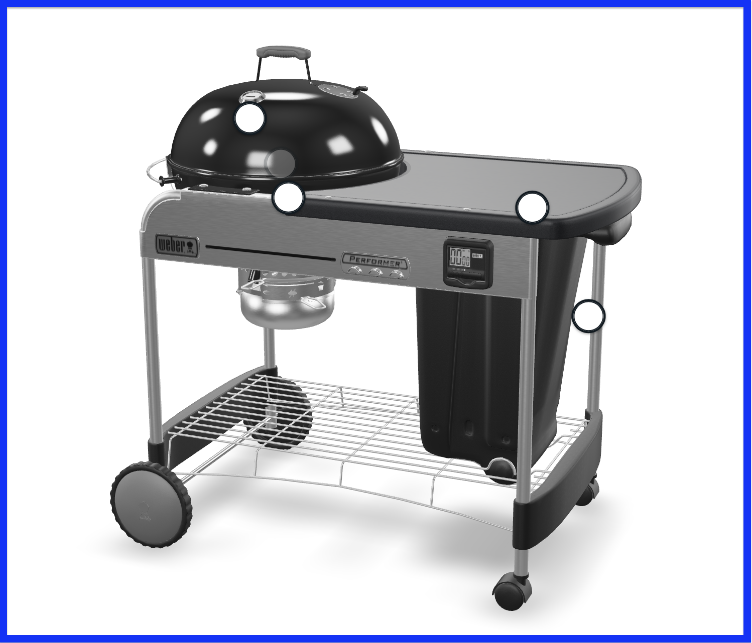
Attributes
The Product Tour, as an extension of the 3D Viewer, shares many of its attributes. For reference, please visit this page.
| Attribute | Type | Default | Description |
|---|---|---|---|
| product-tour-visible | boolean | false | sets visibility of the Product Tour |
| suppress-tour-modal | boolean | false | sets ability to suppress the Product Tour side panel on mobile devices |
Attribute Example
This example shows how to use the sku, viewer-visible, and product-tour-visible attributes:
<epigraph-ar
	sku="INSERT-SKU"
	viewer-visible
	product-tour-visible
></epigraph-ar>
CSS Custom Properties
| Property | Description |
|---|---|
| --hotspot-button-background-color | edits hotspot button background color |
| --hotspot-button-border-color | edits hotspot button border color |
| --hotspot-button-focus-border-color | edits hotspot button border color when focused |
| --hotspot-inner-circle-border-color | edits hotspot button inner circle border color |
| --hotspot-inner-circle-viewed-border-color | edits hotspot button inner circle border color when viewed |
| --mobile-product-tour-button-background-color | edits product-tour mobile button background color |
| --mobile-product-tour-button-text-color | edits product-tour mobile button text color |
| --product-tour-background-color | edits product-tour background color |
| --product-tour-close-button-fill-color | edits product-tour close button fill color |
| --product-tour-close-button-hover-fill-color | edits product-tour close button fill color when hovered |
| --product-tour-close-button-hover-stroke-color | edits product-tour close-button stroke color when hovered |
| --product-tour-close-button-stroke-color | edits product-tour close-button stroke color |
| --product-tour-current-dot-background-color | edits product-tour control dot background color when it points to a current image |
| --product-tour-dot-background-color | edits product-tour control dot background color |
| --product-tour-mobile-close-button-outline-color | edits product-tour mobile close button outline color |
| --product-tour-mobile-close-button-stroke-color | edits product-tour mobile close button stroke color |
CSS Custom Property Example
This example sets the hotspot button background color custom property to blue:
epigraph-ar {
     --hotspot-button-background-color: blue;
 }
CSS Shadow Parts
| Part | Description |
|---|---|
| hotspot-button | points to the hotspot button |
| hotspot-button-annotation | points to the hotspot button annotation |
| hotspot-button-inner-circle | points to the inner circle of the hotspot button |
| mobile-product-tour-button-default | points to the default mobile Product Tour launch button |
| product-tour | points to the <product-tour> element |
| product-tour-carousel-media | points to the media housed inside the side panel carousel |
| product-tour-close-container | points to the close button inside the side panel |
| product-tour-close-default | points to the default close button inside the side panel |
| product-tour-container | points to the side panel container |
| product-tour-feature-content-container | points to the feature content container inside the side panel |
| product-tour-feature-description | points to the description of the feature text inside the side panel |
| product-tour-feature-media-container | points to the containers housing feature media inside the side panel |
| product-tour-feature-text-container | points to the containers housing the feature text inside the side panel |
| product-tour-feature-title | points to the title of the feature text |
| product-tour-content-container | points to the inner content container inside the side panel |
| product-tour-media-carousel | points to the feature media carousels inside the side panel |
| product-tour-media-carousel-dot | points to the control buttons for the media carousels inside the side panel |
| product-tour-media-controls-container | points to the containers housing the control buttons for the media carousels inside the side panel |
| product-tour-media-title | points to the feature media titles inside the side panel |
CSS Shadow Part Example
This example sets the opacity of the hotspot button CSS shadow part to 0.5:
epigraph-ar::part(hotspot-button) {
  opacity: 0.5;
}
Slots
| Slot | Description |
|---|---|
| mobile-product-tour-button | replaces the mobile Product Tour launch button |
| viewer-modal-exit-button | replaces the mobile fullscreen exit button |
Slot Example
This example sets the mobile-product-tour-button slot to a new button element:
<epigraph-ar>
     <button slot="mobile-product-tour-button"></button>
</epigraph-ar>
Events
| Event | Type | Description |
|---|---|---|
| product-tour-requested | CustomEvent<{hotspotData: any; firingEvent: any;}> | custom event to bubble up launching a hotspot if the suppress-tour-modal attribute is enabled |
Event Usage Example
This example listens for the product-tour-requested event on the first instance of epigraph-ar on your page, provided that the suppress-tour-modal attribute is enabled:
let arElement = document.querySelector('epigraph-ar');
arElement.addEventListener('product-tour-requested', (e) => {
  console.log('Product Tour requested');
});
Methods
| Method | Type | Description |
|---|---|---|
| collapse | ():void | public method to collapse the Product Tour side panel |
Method Usage Example
This example shows how to call the collapse method on the Product Tour element within the shadow root of the first instance of epigraph-ar on your page:
<script>
  let arElement = document.querySelector('epigraph-ar');
	let tourElement = arElement.shadowRoot.querySelector('product-tour');
	tourElement.collapse();
</script>