Epigraph-Tour
How do I change the loading logo and text?
You may wish to personalize the experience even further by changing the logo and text that shows up during the loading/splash screen. This is easily achievable by adding 2 simple attributes:
<epigraph-tour
 id="epigraphTour01"
 class="demo-tour"
 sku="<product-sku>"
 splash-screen-logo="<custom-logo-url>"
 splash-screen-text="custom loading text..."
></epigraph-tour>
Is there a list of all CSS variables for basic customizations?
Indeed... Here it is:
--color-brand-base: #335166;
--color-brand-base-secondary: #2b4354;
--color-brand-base-tertiary: #202f3a;
--color-brand-accent: #4276cf;
--color-brand-accent-secondary: #3761a8;
--color-brand-accent-tertiary: #3761a8;
--color-brand-light: #f8fbf6;
--color-brand-dark: #111b22;
--font-brand-heading: "Helvetica Neue";
--font-brand-body: "Inter";
--unit-brand-radius: 4px;
How do I make the background transparent?
There might be cases where you wish to make the background blend better with your website and making the viewer transparent to show what's behind could be one of the ways to achieve that. In order to do so, you just need to add the attribute "transparent-background" to the epigraph solution.
<epigraph-tour
  id="epigraphTour"
  sku="<product-sku>"
  transparent-background
>
</epigraph-tour>
How do I Customize the View In Your Space Button?
To customize the view in your space action button, you have 2 options depending on your use case:
1. Custom button anywhere on the page:
In order to have a custom or an existing button on your web page, you can utilize the API exposed on our solutions.
// Assuming you used the id="epigraphTour01"
const epigraphTourElement = document.querySelector("#epigraphTour01")
const myCustomButton = document.querySelector("#myCustomButton")

myCustomButton.addEventListener(
  "click",
  () => {
    // This will either display a QR modal that can be scanned from an AR compatible device is the current device lacks the ability to do so OR show a modal requesting the user's permission to launch an AR
session and gaining access to the camera (for current session only).
    epigraphTourElement.launchAR();
  }
);
2. Custom button within the epigraph solution:
In order to put a custom view in your space within the epigraph-tour solution. You can utilize the web component slots, which work no differently than the regular HTML with the exception of mentioning which slot you wish to target by using a "slot" attribute:
<style>
  .custom-button {
    width: 150px;
    height: 50px;
    border-radius: 10px;
    background-color: rgba(255, 167, 167, 1);
    transition: 0.25s;
  }

  .custom-button:hover {
    background-color: rgba(189, 93, 93, 1);
    color: white;
    cursor: pointer;
  }
</style>

<epigraph-tour
  id="epigraphTour"
  class="demo-tour"
  sku="<product-sku>"
>
  <button slot="slot-custom-view-in-your-space-button" class="custom-button">Custom Button</button>
</epigraph-tour>
In this case we target the slot named: "slot-custom-view-in-your-space-button". By default this slot is empty and doesn't display anything unless something is provided using the steps above.
Want the Tour as Full screen on demand?
By default an epigraph-tour is designed to always be used as a widget on the page but in a case where you'd like to implement a button that opens up the tour in a full screen modal, you may do so following the instructions below:
- Add an attribute "modal-view" to the tour component, which will hide the component by default.
<epigraph-tour id="epigraphTour" modal-view></epigraph-tour>- Now you may add a button, image, or any actionable HTML element on your page which will trigger the tour to open in a full screen modal on request, like so:
const showTourButton = document.querySelector("#showTourButton");
showTourButton?.addEventListener("click", () => {
  const epigraphTourElem = document.querySelector("#epigraphTour");
  epigraphTourElem.showFullScreenModal();
});
How do I customize the styles of these solutions?
There might be instances where you might want to customize the CSS styling of the components within our solutions. In order to do so, we provide a functionality to define a custom <template> element on the
page with the id set to "epigraphCustomStyles" (VERY IMPORTANT). Now whatever CSS class or selector you target from in here should pick up the style overrides at runtime. The only thing to remember is that
certain properties might be enforced internally and you may need to use the "!important" successor on these property values to override the internal values.
IMPORTANT: Please ensure that this template is appended to the page before you add any of our solutions to the page in order for them to pick up the overrides.
<template id="epigraphCustomStyles">
    <style>
        .collapse-expand-button {
            background-color: green !important;
        }

        .hotspot-main {
            background-color: rgb(208 230 197 / 90%) !important;
        }
    </style>
</template>
How do I adjust the camera padding?
By default the camera always adjusts based on a sphere drawn around the objects in scene. This is very reliable to ensure that your product never clips out of the view. But there might be times where this might not look right, like at certain aspect ratios. For example: look at the shoe attached below, it looks correct on a standard 16:9 screen aspect ratio but in the second image, where the aspect ratio is wider, the sphere still sits intact within the viewport height, causing a lot more extra space on the left and right hand side of the product.
While this works in most of the cases and is done to ensure the most predictable behaviour in an experience, you may want the ability to adjust the zoom within the camera a little. In order to do so, you add an attribute to the epigraph-tour web component:
<epigraph-tour
  id="epigraphTour"
  class="demo-tour"
  sku="<product-sku>"
  camera-bounds-multiplier="1" // Lower values bring the camera closer and vice versa
></epigraph-tour>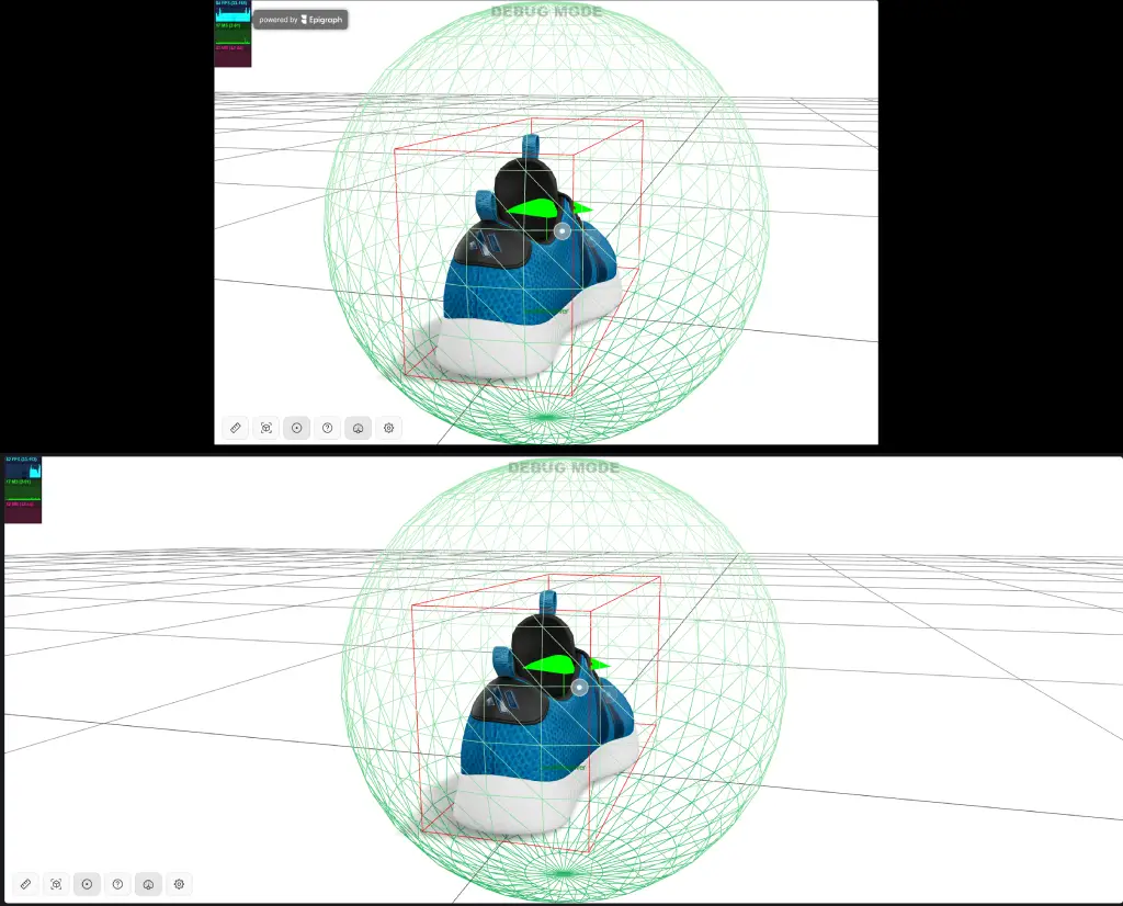
How do I hide hotspots on start?
In order to direct more attention towards the highlighted features of your product, <epigraph-tour> displays the hotspots by default in the scene, on startup. In order to not have this behaviour and not
show hotspots on startup, you can add the attribute hide-hotspots-on-start:
<epigraph-tour
  id="demoTour"
  sku="sku-epigraph-logo-red"
  hide-hotspots-on-start
></epigraph-tour>
How do I customize the view in your space modal?
When it comes to customizing the look of the View in your space modals, both QR and AR launcher. You have one of the 2 options to choose from:
- [Quicker but Limited] Customize the existing modal using CSS. The CSS below is just an example and you need to make some additional adjustments as per your desire.
<template id="epigraphCustomStyles">
	<style>
    .qr-code-and-desc-container {
        flex-direction: column;

        #qrImage {
            width: 100px !important;
            height: 100px !important;
        }
    }

    .qr-code-desc-container {
        align-items: center;
    }

    .qr-code-title-subtitle-container .subtitle {
        display: none !important;
    }

    .modal-button {
        display: none;
    }

    .powered-by-epigraph-footer {
        display: none !important;
    }

    .dialog-content {
        padding: 80px !important;
    }

    .dialog-content.footer-padding {
        padding-bottom: 80px !important;
    }

    .dialog {
        border-radius: unset !important;
		}
	</style>
</template>
- [Advanced but full control] Implementing custom Modal and tying into the API we provide (we use this internally as well) Create 2 custom modals on the page. One for the QR code (non AR compatible devices) and the other for the AR launcher (AR compatible devices)
function async showCustomQrModal() {
   const qrModal = // get the reference to your custom HTMLmodal
   const qrCodeImage = await epigraphTourRef.api.getViewInYourSpaceQR();
   // Display the qrCodeImage inside you custom modal...
}

function async showCustomArModal() {
   const arModal = # get the reference to your custom HTMLmodal
   const arLinkUrl = await epigraphTourRef.api.getViewInYourSpaceUrlString();
   // Set this arLinkUrl as the click action on your "Launch Ar" button within this modal.
}

function async onViewInYourRoomButtonClick() {
    const canLaunchAr = epigraphTourRef.api.canLaunchAr()
    if (canLaunchAr) {
        await this.showCustomArModal();
    } else {
        await this.showCustomQrModal()
    }
}
How do I stop the camera from resetting on sku change?
There might be use cases when you don't want the camera to reset on sku/identifier change. By default, the camera will move back to the initial position but it might not be desired, specially when somebody is only changing the finishes. Use the property variant-switch-mode="seamless" to achieve a smoother transition.
<epigraph-tour sku="123" variant-switch-mode="seamless"></epigraph-tour>