AR Button/QR Modal
Attributes
| Attribute | Type | Default Value | Description |
|---|---|---|---|
sku |
string |
sets the sku corresponding to the epigraph experience |
|
button-mode |
string |
"mobile desktop" |
sets the AR button modes: |
ar-button-rollover-nudge |
boolean |
false |
toggles the ability to show a rollover nudge upon hover (only functional in button only mode, see the Standalone AR Button Example) |
Attribute Example
This example sets the sku and button-mode attributes of the AR Button:
<epigraph-ar
	sku="INSERT-SKU"
	button-mode="mobile desktop"
></epigraph-ar>
CSS Custom Properties
| Property | Web Component | Description |
|---|---|---|
| --ar-button-active-background-color | AR Button | edits ar-button background color when clicked |
| --ar-button-background-color | AR Button | edits ar-button background color |
| --ar-button-border-color | AR Button | edits ar-button border color |
| --ar-button-hover-background-color | AR Button | edits ar-button background color when hovered |
| --ar-button-hover-text-color | AR Button | edits ar-button text color when hovered |
| --ar-button-text-color | AR Button | edits ar-button text color |
| --ar-icon-frame-color | AR Button | edits ar-icon frame color |
| --ar-icon-hover-frame-color | AR Button | edits ar-icon frame color when hovered |
| --ar-icon-hover-vector-1-color | AR Button | edits ar-icon vector 1 (top face) color when hovered |
| --ar-icon-hover-vector-2-color | AR Button | edits ar-icon vector 2 (left face) color when hovered |
| --ar-icon-hover-vector-3-color | AR Button | edits ar-icon vector 3 (right face) color when hovered |
| --ar-icon-vector-1-color | AR Button | edits ar-icon vector 1 (top face) color |
| --ar-icon-vector-2-color | AR Button | edits ar-icon vector 2 (left face) color |
| --ar-icon-vector-3-color | AR Button | edits ar-icon vector 3 (right face) color |
| --qr-modal-close-button-stroke-color | QR Modal | edits qr-modal close button stroke color |
| --qr-modal-done-button-active-background-color | QR Modal | edits qr-modal done button background color when clicked |
| --qr-modal-done-button-background-color | QR Modal | edits qr-modal done button background color |
| --qr-modal-done-button-border-color | QR Modal | edits qr-modal done button border color |
| --qr-modal-done-button-hover-background-color | QR Modal | edits qr-modal done button background color when hovered |
| --qr-modal-done-button-hover-text-color | QR Modal | edits qr-modal done button text color when hovered |
| --qr-modal-done-button-text-color | QR Modal | edits qr-modal done button text color |
| --qr-modal-instruction-color | QR Modal | edits qr-modal instruction text color |
| --qr-modal-r--qr-modal-requirement-color | QR Modal | edits qr-modal requirement text color |
| --qr-modal-title-color | QR Modal | edits qr-modal title text color |
CSS Custom Property Example
This example sets the AR button active background color custom property to blue:
epigraph-ar {
     --ar-button-active-background-color: blue;
 }
CSS Shadow Parts
| Shadow Part | Web Component | Description |
|---|---|---|
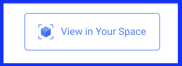
| ar-button-container | AR Button | points to the AR button container |
| default-ar-button | AR Button | points to the default AR button |
| ar-button-rollover-nudge | AR Button | points to the AR button rollover nudge (if enabled) |
| qr-modal | QR Modal | points to the <qr-modal element |
| qr-modal-background | QR Modal | points to the QR Modal background |
| qr-modal-close-default | QR Modal | points to the default close button in the QR Modal |
| qr-modal-container | QR Modal | points to the main modal container |
| qr-modal-done-default | QR Modal | points to the default done button in the QR Modal |
| qr-modal-instruction-default | QR Modal | points to the default instructions in the QR Modal |
| qr-modal-qr-container | QR Modal | points to the QR image container within the QR Modal |
| qr-modal-qr-image | QR Modal | points to the QR image in the QR Modal |
| qr-modal-requirement-default | QR Modal | points to the default requirements in the QR Modal |
| qr-modal-title-default | QR Modal | points to the default title in the QR Modal |
CSS Shadow Part Example
This example sets the width and height of the ar-button-container CSS shadow part to 100px:
epigraph-ar::part(ar-button-container) {
    width: 100px;
  	height: 100px;
}
Slots
| Slot | Web Component | Description |
|---|---|---|
| ar-button | AR Button | replaces the ar-button but maintains the onclick function |
| ar-button-rollover-nudge | AR Button | replaces the nudge section that appears on hover (if enabled) |
| qr-modal-close | QR Modal | replaces the QR Modal close button |
| qr-modal-done | QR Modal | replaces the QR Modal done button |
| qr-modal-instruction | QR Modal | replaces the QR Modal instructions |
| qr-modal-requirement | QR Modal | replaces the QR Modal requirements |
| qr-modal-title | QR Modal | replaces the QR Modal title |
Slot Example
This example sets the ar-button slot to a new button element:
<epigraph-ar>
     <button slot="ar-button"></button>
</epigraph-ar>
Events
| Event | Type | Description |
|---|---|---|
| epigraph-ar-capability-determined | CustomEvent<{ canActivateAr: any; }> | custom event to indicate whether the device is AR capable |
| epigraph-ar-model-loaded | custom event to bubble up the model loaded event from model-viewer | |
| epigraph-ar-loading-error | CustomEvent<{ message: any; stack: any; }> | custom event to bubble up the model load error event from model-viewer, inheriting message and stack |
| qr-modal-requested-error | custom event that sends if an error was received when requesting a QR code |
Event Usage Example
This example listens for the epigraph-ar-model-loaded event on the first instance of epigraph-ar on your page:
let arElement = document.querySelector('epigraph-ar');
arElement.addEventListener('epigraph-ar-model-loaded', (e) => {
  console.log('Model Loaded');
});